Call or email today for a free consultation.
How to stroke text in Illustrator: A tutorial
- Mobile-responsive tables March 19, 2014 at 2:39 pm
- Contenteditable text editor in a web browser October 22, 2013 at 5:55 pm
- HTML CSS3 3D Panorama viewer with accelerometer and compass in the stock October 22, 2013 at 12:35 pm
- Circular rotation in Javascript October 22, 2013 at 10:13 am
- How to stroke text in Illustrator: A tutorial July 21, 2013 at 11:20 pm
- How I saved a client $60,000 (or, Where To Tap) July 21, 2013 at 9:21 pm
- How much does a website cost? July 21, 2013 at 8:21 pm
- Use htaccess to rewrite URLs with query strings July 21, 2013 at 7:22 pm
- Ian Tregillis web site July 21, 2013 at 3:04 pm
- Web design as an art form July 21, 2013 at 2:59 pm
I was working with a young (and maybe a little arrogant) print designer who was creating a web design in Illustrator. Since his design featured text with an outline (a stroke), I asked him to just stroke the text instead of having two layers of text.
"In illustrator you NEVER simply stroke text," he replied. "The stroke cuts in to the typeface ruining thicks and thins. The professional way is to double the stroke and drop it in behind."
Well, now. I can see I've been schooled by a professional.
I don't use Illustrator unless I'm creating a logo or need good bezier curve control for shapes, or text, but an awful lot of print designers mistakenly do everything in Illustrator. This is because you can scale your illustration to any size without losing sharpness, which you can't really do in Photoshop. But, since everything online is at 72dpi and that won't change any time soon, Photoshop is the web designer's tool of choice. Photoshop lets you choose whether the stroke goes on the inside, center, or outside of the character form, so it's never really been a problem for me. But what about all those helpless print designers who have to type everything twice? Can there be no reprieve from the tedium for them?
Will nobody think of the print designers?
OK, Mr. "NEVER-simply-stroke-text". Stand aside and I'll show you how an amateur does it.
Open Illustrator. If it's already open, slow down, I'll be right with you. Brown-noser. In a new document, type some text that you want to stroke like an amateur. Holy crap, that one's going to bring in some weird Google hits. If your Appearance Palette isn't yet open, open it from the "Window" menu.
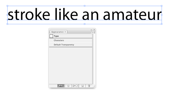
Click on the Appearance Palette drop-down menu just beneath the palette's close button in the upper-right hand corner. Curse the Adobe usability expert who put it so close to the close box and re-open the palette. From the drop-down menu (careful!) choose "Add new stroke" and drag that layer behind the fill.
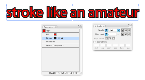
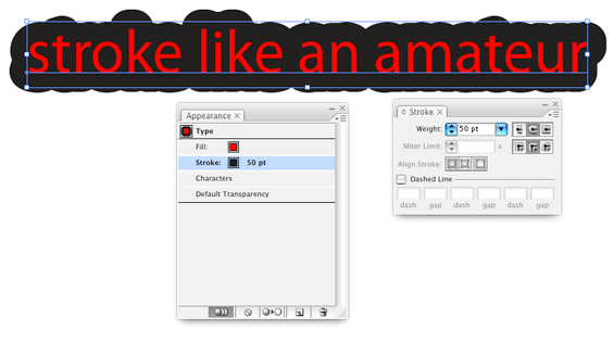
Choose the miter join option which will make your text sexy. There, that ought to bring in the porn-reading design professionals. Here you see the familiar "Stroke" and "Fill" options. Choose a pretty color for the stroke. In the "Stroke" palette, type in a stroke size that is double the actual stroke thickness you want, since Illustrator strokes from the center of the shape.
"But I need two strokes," you say.
Pffft. Professionals.
Just add a new stroke from the drop-down menu, drag it behind the fill, adjust the stroke thickness and miter join option to taste, and serve.
That's it. Not only is it easier to do, it is easier to edit since there's only one layer of text.
But if any of you reading along use Illustrator to design your web pages, I'll break your legs.


Comments
thank you so much for this .... its becum so helful to me
God Bless !!!